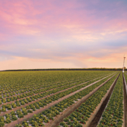
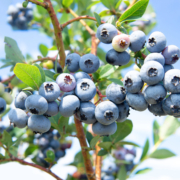
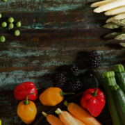
Well•Pict


Print & Digital Media
Maintaining a strong brand reputation among retailers for delivering exceptional, proprietary berries meant creating a yearly campaign with a strategic media buy and creative to stand out against all others. Each year had a new and exciting campaign theme utilizing bold colors and catchy taglines. Within the campaign 6 – 8 different ads were developed for use throughout the year to keep the creative fresh and intriguing.
Recipe Development – Food Styling – Photography
Delicious berries deserve to star in delicious recipes! Custom recipes were developed for use on the website as well as social media. Recipes would incorporate trending flavor profiles, health, and cooking trends. Bringing the recipe to life with food styling and photography is the best (and tastiest!) part of the process.


Tradeshow
We all know the stress levels can increase significantly when tradeshow planning is looming over someone’s head. We offer full tradeshow management and design to remove the stress and let you shine. Everything from logistically planning, hotel reservations, dinner and private parties, booth orders, and concepting and developing booth builds. Additionally, we offer onsite booth staffing and sample recipe prep.
- Booth Design and Fabrication
- Tradeshow logistical planning
- At-show support for set-up and tear-down
- Recipe development for booth sampling
- Recipe sample prep and delivery to show
- Booth hostess for sampling during show hours
Consumer Commercial
The client needed a fun and engaging way to educate consumers on the benefits of their proprietary berries and what sets them apart from other berries on the market. Thus, ‘Be A Berry Snob’ was born to be utilized on social media as well as across streaming networks in markets based on product availability and season.
Berry Fresh

Tradeshow
Berry Fresh came to us in need of a 20×20 tradeshow booth. Since they had never exhibited at a tradeshow in a space of that size, we had to start at the beginning. Storage and meeting space were a must as well as featuring their product with high-impact graphics. The booth structure was modified to incorporate a large, walk-in storage closet and the sections allowed for division between meeting space in the back for privacy and a front reception area.
- Booth Design and Fabrication
- Tradeshow logistical planning
- At-show support for set-up and tear-down
- Recipe development for booth sampling
- Recipe sample prep and delivery to show
- Booth hostess for sampling during show hours
Trinity Company

Tradeshow
As a grower, packer, shipper of multiple fruit commodities as well as processed juices, Trinity Company need a booth space that would allow for featuring product in both floor displays as well as refrigerated merchandising displays. The structure allowed for guest access to the booth from all sides and put the product as the focus right in the center of the booth.
- Booth Design and Fabrication
- Tradeshow logistical planning
- At-show support for set-up and tear-down
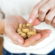
Nic’s Mix


Research
Nichols Farms came to us wanting to create packaging that reflected its family legacy as it launched a mixed nut product into Costco. Ensuring that a product will sell off this mega-retailers shelves is the secret to long term product placement. As we worked through packaging designs, we incorporated target audience research to assist in the final design selection. This real shopper data allowed us insights into the packaging appeal of other pistachio and mixed nut retailers as well as provided clear direction for design revisions that would resonate with consumers.
Packaging
Since Nichols Farms has been in the farming industry since 1983, incorporating the history of Nichols Farms into the product was important. So, when we finalized the naming and created the packaging for Nic’s Mix, we included subtle nods to its origins while keeping things light and playful.
The front of the packaging includes nature patterns to represent the orchards planted more than 35 years ago. The whimsical logo matched with the bold product photo showcases the feel of what Nic’s Mix is. A clear window into the product itself boldly and visually draws a consumer’s eye. Finally, the back of the packaging highlights the story of Nichols Farms, an integral part of the character of the product.


Trade Show Banners
I guess you can say we are nuts about trade shows, so we were excited to create retractable banners showcasing the yummy products in Nic’s Mix. We started with the key to Nichols Farms: pistachios, the main ingredient in Nic’s Mix and the nut that started it all. This gave the banners an eye-catching look while sticking true to the brand and the cascade of products.
Photography
We started shooting for Nic’s Mix as soon as we could get our hands on the product. We knew that including a bold photo of the product was going to be the best way to showcase exactly what the product was. Once the packaging was finalized was when the real fun began. Some may say shooting a product that has a picture you took on it is pretty meta, but we just call that a normal Tuesday.

Crystal Valley Foods
FOODS

Branding
Creating a fun and fresh update to an already great brand is one of our specialities. For Crystal Valley Foods, we focused on what it stands for: quality. As industry leaders in sustainable growing practices, we focused on curating a brand that showcased the highest-quality fruits and vegetables for which Crystal Valley Foods was best known.
Packaging
When creating a design for the packaging, we knew that we needed to elevate the layout to showcase the quality of the products, while maintaining the look customers knew and loved. So, we created simple yet sleek designs that brought in elements of Crystal Valley Foods’ history. Our favorite? The bold zig-zags that represent the iconic mountains of Crystal Valley Foods.


Logo Refresh
The key to a true logo refresh is seeing what works and what doesn’t. For Crystal Valley Foods, it was all about balance and symmetry. In perfecting the balance and symmetry of the logo, the crisp, updated logomark created harmony for the brand. This refresh was a testament to the quality of the brand’s promise of delivering the highest-quality goods every time.

SimpliPure


Brand Development
DairyAmerica came to us with a simple goal: brand a new, premium lactose product produced by a cooperative of shareholding dairy farmers across the country. We started with the basics: brand positioning, brand architecture, and brand extension. Each served as a logical and strategic step into reaching the target audiences.
From here, the fun began. Once we defined the brand architecture – and how this premium product would align with other DairyAmerica lactose product, we got to work on a name. After some (okay, a lot of) deliberation, we landed on Simplipure: a nod to the simplicity of the product paired with the highest purity standards for lactose.
Logo
When creating Simplipure’s logo, we knew we wanted to keep it simple yet upscale, just like the product. We took inspiration from lactose itself, with a nod to the food scientists who would be the target audience for purchasing this new product. The hexagons, which frame the brand name, are representative of the shape in which sugar molecules bind together to form lactose. We then brought the logo to life with movement using animation.

Landing Page
If you don’t have a website, you don’t exist, right? So for Simplipure, we built a landing page that would provide essential information and capture leads in the early stages of the product sales process. The most important message to convey is product clarity, so a time lapse video was built into the page to clearly deliver this mission critical message.
Business Cards
Business cards are an old-school classic that can be a customer’s first impression with a company and its products. We wanted to create a design that grabbed attention while still maintaining the integrity of what Simplipure is. We kept it simple: the logo, the branding and the message. The result? A sleek, innovative twist on an old school classic.


Packaging
For Simplipure packaging, we wanted to focus on what the product was: lactose evolved. We knew the product could speak for itself, but the packaging needed to signal that this product was different. All of DairyAmerica’s lactose products are packaged in craft paper (brown) color, so we had to do a little convincing to package this product in white. While the white does cost a little more, it immediately conveys that this is a premium product.
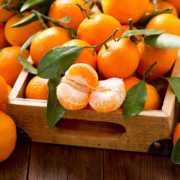
Fruit World

Brand Development
To brand or not to brand, that was Fruit World’s big question. We knew coming into the already competitive mandarin market that Fruit World needed to stand out.
So, we went all-in in curating a brand that was recognizable and encompassed the whimsical feel of Fruit World. We started with the color palette which we believe should be driven by one word: fresh.
Its existing, iconic pink color set the tone for Fruit World’s brand, and it was our intent to own this color in the retail space. The most vibrant, playful hues were chosen to interplay with the pink and the color of the produce to create a stand-out in the market.
Packaging
For packaging, we explored a LOT of options: 31 to be exact! We wanted to create a streamlined packaging that was cohesive with the new branding. Playing on the hills east of Reedley that reminded consumers of Fruit World’s roots, we created packaging designs that embodied the whimsical world of Fruit World, creating a sense of place.
We started with the mandarin bags and focused on the little details. From the texture of the hills to the details in the logo, we wanted to make sure Fruit World stood out while honoring its Central Valley roots.


Sales Sheets
Sales sheets are a one-stop shop to showcase all the best aspects of your products. With cohesive branding and informative content, we were able to create sales sheets that spoke to the unique packaging of each product while giving retailers the information they needed to make informed buying decisions.

Sran Family Orchards
ORCHARDS


Logo Refresh
Growing organic almonds takes true integrity, and that’s exactly what we wanted Sran’s new logo to represent. This new design contains a new color scheme and font display while keeping its original imagery to uphold its strong history.
Photography & Videography
Imagery is essential for your audience to understand the who, what, why and how of your brand. Farm To Shelf’s photographer traveled to Kerman to capture photos of Sran’s facility, product, employees and family. He also filmed while on site and created a stunning video for Sran’s website.

Website Refresh
- Mobile Responsive
- Screen Responsive
- SEO Optimized
- CMS Accessible
- Video Features
- Modern Design
Sales Brochures
One-sheets and brochures are an excellent way to leave a lasting impression on your target audience. With crisp imagery, a cohesive color scheme and informative content, these materials promote Sran’s brand message, aid in acquisition of new customers, and ultimately lead to a higher return on investment.


Tradeshow Booth
Once Sran had its logo, website and print production refreshed, it was time to shine. One of the best ways (and frankly, the most fun way) to do so was through a trade show booth. We integrated all of Sran’s updated branding and color scheme to create a fresh and welcoming booth.
Public & Media Relations
Farm To Shelf has an accredited public relations team which was able to ensure Sran’s refreshed brand was noticed. Our team was able to get Sran into a variety of media outlets including online, print, local and national.

Peelz


Logo Design
Together with Fowler Packing, our creative team quickly brainstormed everything from name ideas to color palettes. A dozen logos and several pounds of mandarins later, Peelz was decided. The smile humanizes the brand and warmly invites consumers to choose this brand of well-known fruit. The design direction opens the door to playful and purposeful elements, including developing a voice for the brand.
Product Packaging
Once the logo was selected and fine-tuned, we immediately began the packaging process. Our design team examined the competition and looked at packaging opportunities from every angle. How would the bags look in a produce section? What can we do to make Peelz stand out? We took our new logo and applied it to the crucial elements: boxes and bags.
“THANK YOU ALL FOR THE INCREDIBLE WORK ON THE BAG PHOTOGRAPHS, TRADE SHOW BOOTH, AND LANDING PAGE DESIGN. THEY LOVED EVERYTHING AND YOU GUYS ARE JUST KNOCKING IT OUT OF THE PARK. I CAN’T THANK YOU ENOUGH FOR ALL TIME AND ENERGY YOU ARE PUTTING INTO OUR BRAND. THANK YOU!”
– KIAH RUVALCABA, DIRECTOR OF MARKETING


Ag Website
- CMS Accessible
- Modern, One-Page Design
- Lite for Quick Loading
- Cross Browser Adaptability
- Mobile and Tablet Friendly
Trade Show Booth
When you’re up against the cream of the mandarin crop, it’s important to introduce your new brand in a way that’s memorable with a booth space that’s interactive and fun. For the Produce Marketing Association’s largest trade show, we designed a putting green with custom Peelz golf balls as swag.

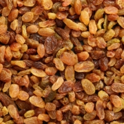
Raisels
Award-Winning Campaign


Social Media Management
Having an innovative and different product means you need to stand out on social media. The Farm to Shelf social media experts have done just that for Raisels by combining bright, colorful and fun imagery with quirky and interactive content.
Animation
Raisels is a bold taste with a different approach to the market. Our Farm to Shelf in-house animator made sure to capture the unique look and fun persona of the product. The bold imagery and eccentric animation really show the personality of the brand to its audience, differentiating it from others in the market.


Email Marketing
With an engaged audience on social media, we strategically implemented email marketing campaigns for direct product sales and to complement our social media efforts. The email database receives regular updates with specials targeted towards each season and connects with our sales platform so we can track how many purchases were produced from the email. In the case of our Halloween eblast, we announced the launch of the new 96-count Raisels and sold out of inventory within 48 hours!

With our combined expertise in agriculture and family-owned business, we understand what retailers want. Our comprehensive services and programs move brands forward in the ever-changing landscape. We’re experienced across an array of ag industries and love to roll up our sleeves to connect products to people.
Send Us A Message
![]()
677 W Palmdon Drive, Suite 101
Fresno CA 93704
(559) 438-2180
STAY UP TO DATE.
© Copyright 2025 – Farm To Shelf