Fruit World
Brand Development
To brand or not to brand, that was Fruit World’s big question. We knew coming into the already competitive mandarin market that Fruit World needed to stand out.
So, we went all-in in curating a brand that was recognizable and encompassed the whimsical feel of Fruit World. We started with the color palette which we believe should be driven by one word: fresh.
Its existing, iconic pink color set the tone for Fruit World’s brand, and it was our intent to own this color in the retail space. The most vibrant, playful hues were chosen to interplay with the pink and the color of the produce to create a stand-out in the market.
Packaging
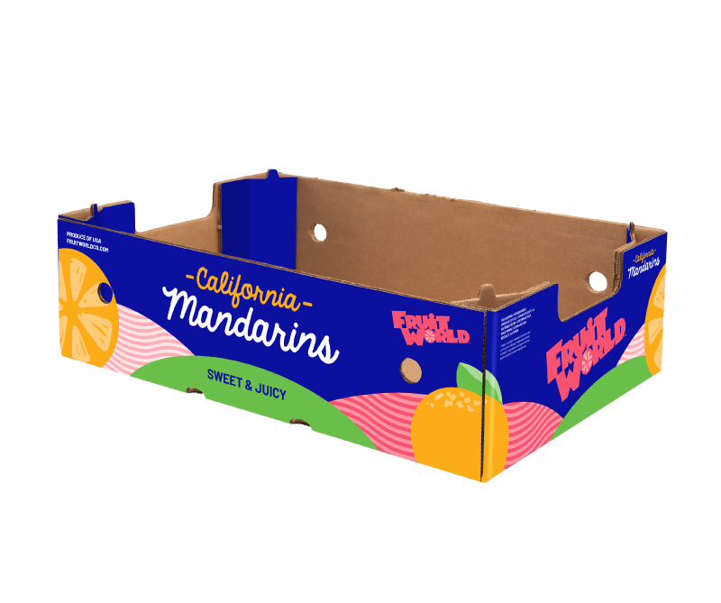
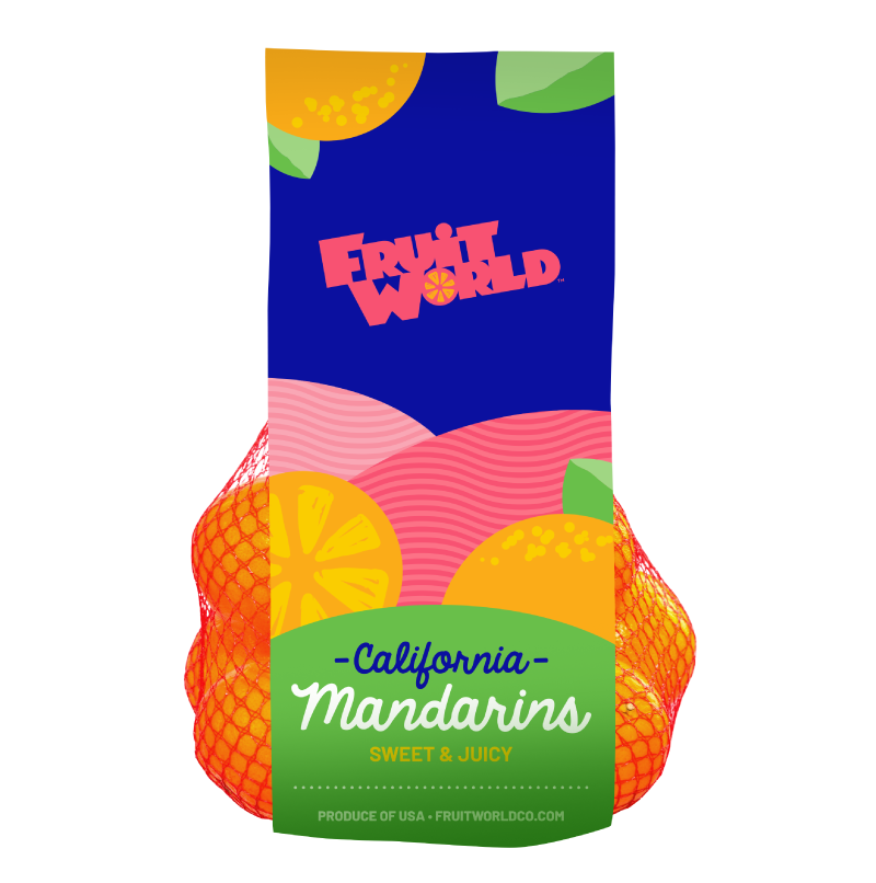
For packaging, we explored a LOT of options: 31 to be exact! We wanted to create a streamlined packaging that was cohesive with the new branding. Playing on the hills east of Reedley that reminded consumers of Fruit World’s roots, we created packaging designs that embodied the whimsical world of Fruit World, creating a sense of place.
We started with the mandarin bags and focused on the little details. From the texture of the hills to the details in the logo, we wanted to make sure Fruit World stood out while honoring its Central Valley roots.
Sales Sheets
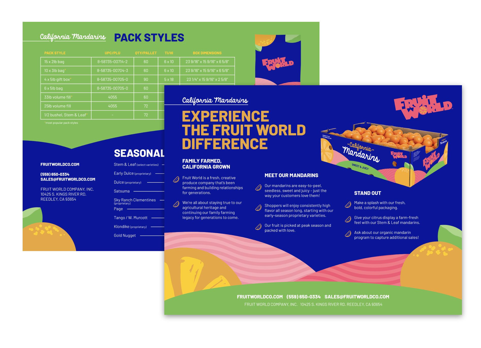
Sales sheets are a one-stop shop to showcase all the best aspects of your products. With cohesive branding and informative content, we were able to create sales sheets that spoke to the unique packaging of each product while giving retailers the information they needed to make informed buying decisions.
Sran Family Orchards
Logo Refresh
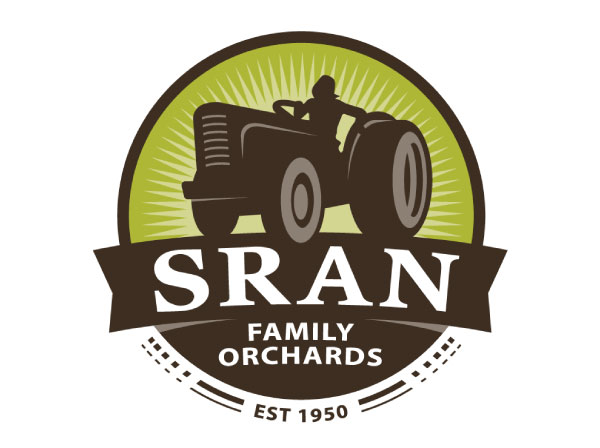
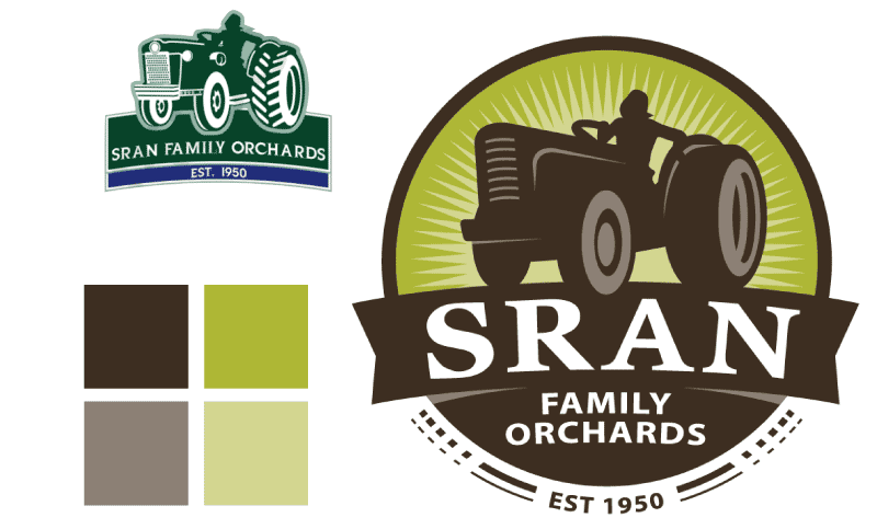
Growing organic almonds takes true integrity, and that’s exactly what we wanted Sran’s new logo to represent. This new design contains a new color scheme and font display while keeping its original imagery to uphold its strong history.
Photography & Videography
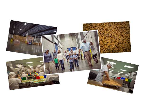
Imagery is essential for your audience to understand the who, what, why and how of your brand. Farm To Shelf’s photographer traveled to Kerman to capture photos of Sran’s facility, product, employees and family. He also filmed while on site and created a stunning video for Sran’s website.
Website Refresh
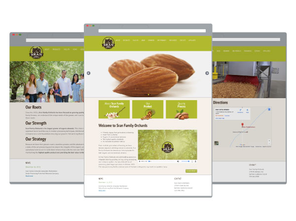
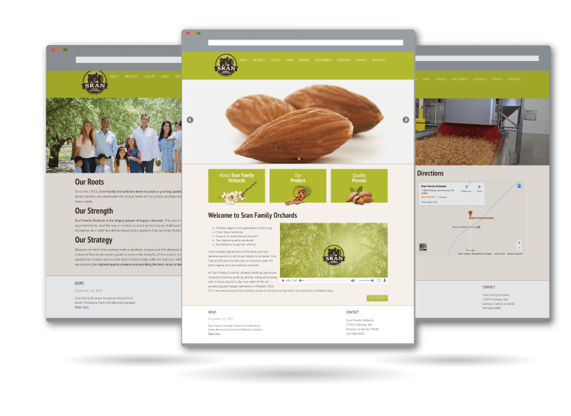
- Mobile Responsive
- Screen Responsive
- SEO Optimized
- CMS Accessible
- Video Features
- Modern Design
Sales Brochures
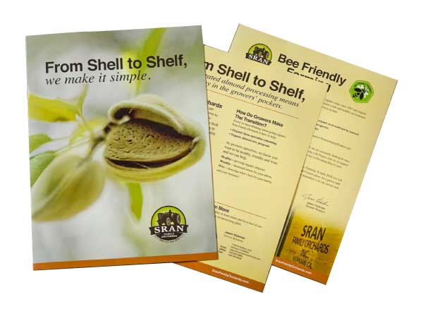
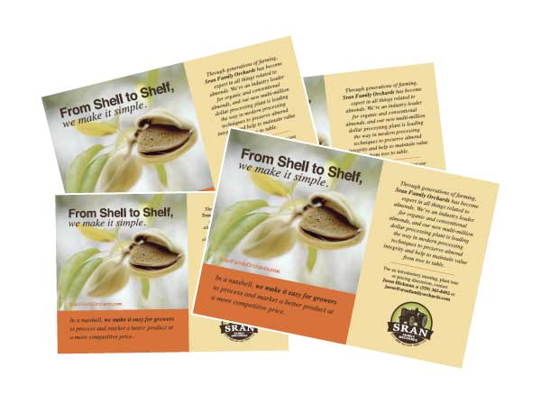
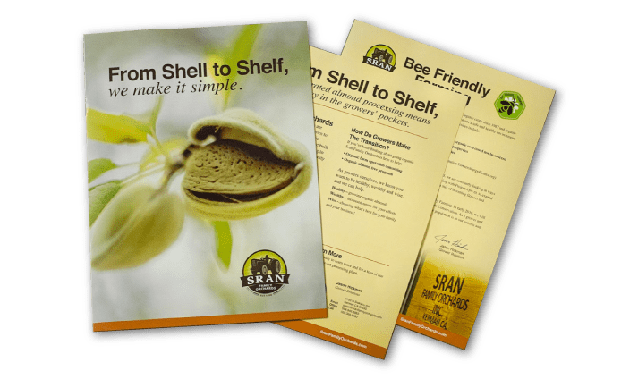
One-sheets and brochures are an excellent way to leave a lasting impression on your target audience. With crisp imagery, a cohesive color scheme and informative content, these materials promote Sran’s brand message, aid in acquisition of new customers, and ultimately lead to a higher return on investment.
Tradeshow Booth
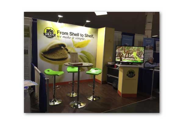
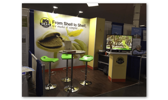
Once Sran had its logo, website and print production refreshed, it was time to shine. One of the best ways (and frankly, the most fun way) to do so was through a trade show booth. We integrated all of Sran’s updated branding and color scheme to create a fresh and welcoming booth.
Public & Media Relations
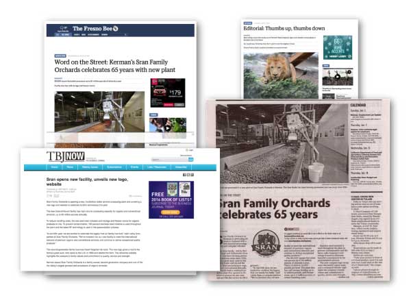
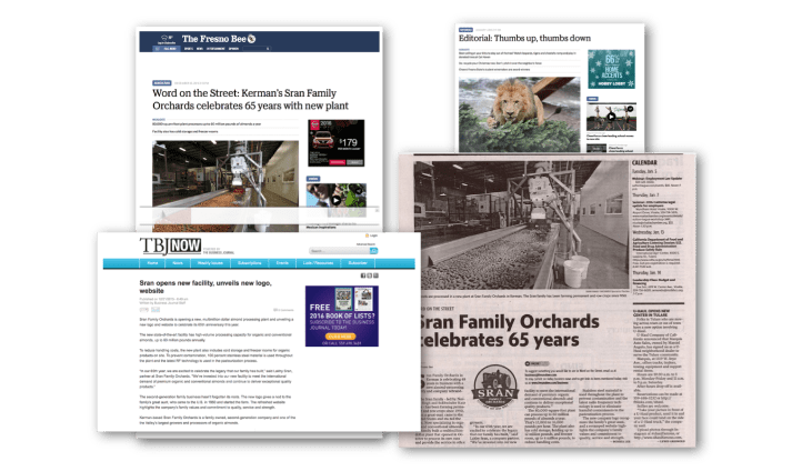
Farm To Shelf has an accredited public relations team which was able to ensure Sran’s refreshed brand was noticed. Our team was able to get Sran into a variety of media outlets including online, print, local and national.
Raisels
Social Media Management
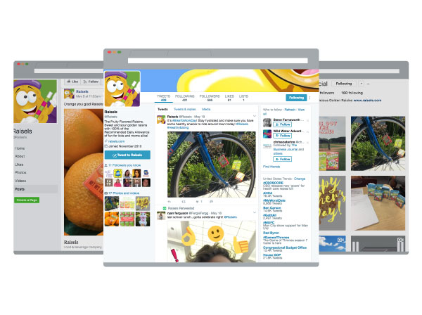
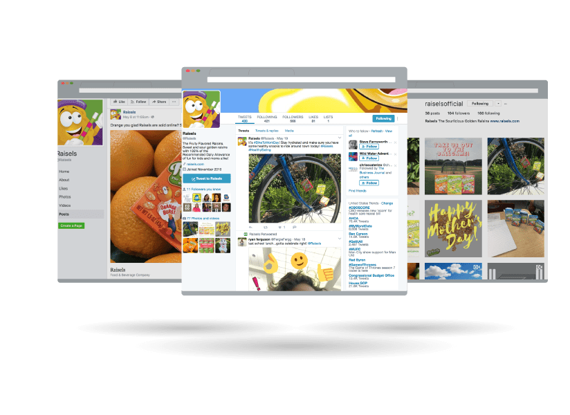
Having an innovative and different product means you need to stand out on social media. The Farm to Shelf social media experts have done just that for Raisels by combining bright, colorful and fun imagery with quirky and interactive content.
Animation
Raisels is a bold taste with a different approach to the market. Our Farm to Shelf in-house animator made sure to capture the unique look and fun persona of the product. The bold imagery and eccentric animation really show the personality of the brand to its audience, differentiating it from others in the market.
Email Marketing
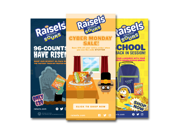
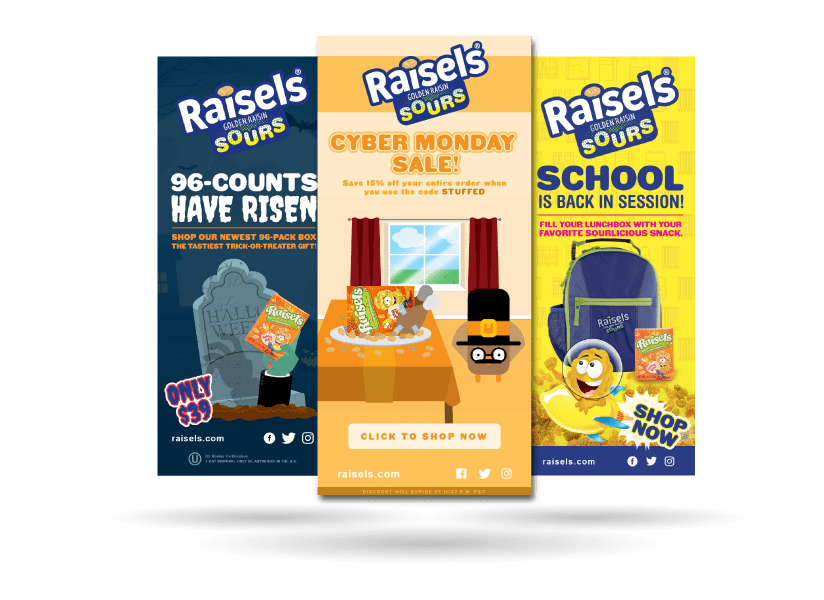
With an engaged audience on social media, we strategically implemented email marketing campaigns for direct product sales and to complement our social media efforts. The email database receives regular updates with specials targeted towards each season and connects with our sales platform so we can track how many purchases were produced from the email. In the case of our Halloween eblast, we announced the launch of the new 96-count Raisels and sold out of inventory within 48 hours!
Golden State Hops
Logo Design & Branding
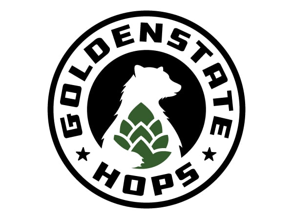
When you look at the up-and-comers in the brewing industry, branding is everything. We created a brand that not only conveyed a strong and serious attitude, but allowed customers to make the visual connection that these were California-grown hops. This full-formed logo allows the hop-holding bear to be a standalone brand mark as Golden State Hops evolves.
Business Cards
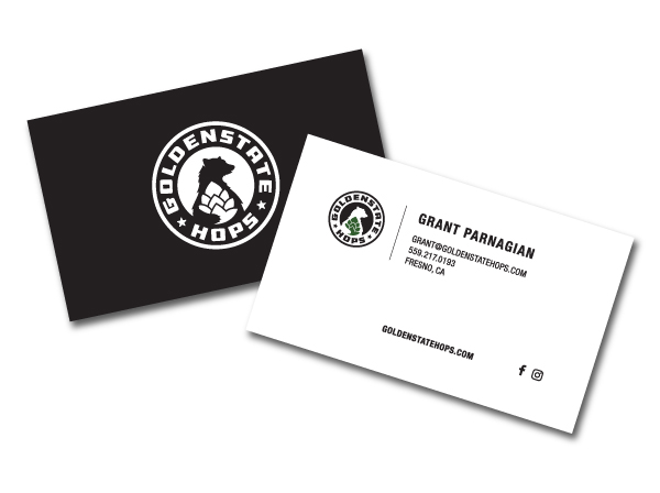
Networking would prove to be one of the best marketing tactics for Golden State Hops, as its team met with brew masters from across Central California. In lieu of traditional advertising, this business card would be the first step in its valuable business partnerships.
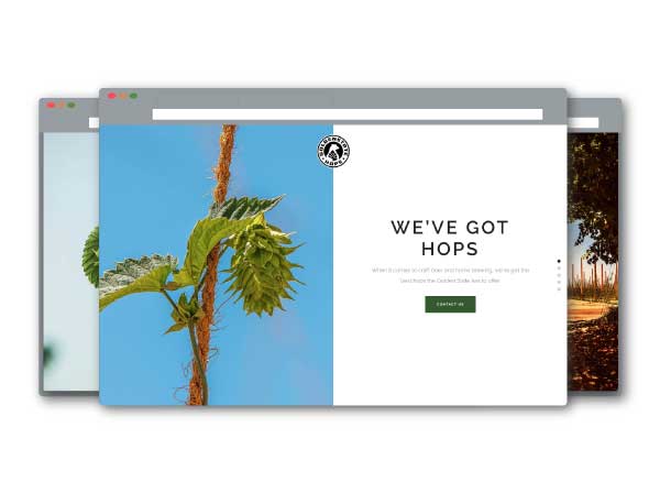
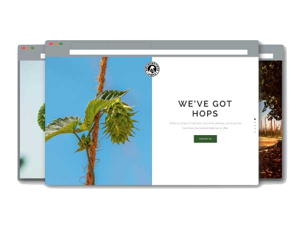
Ag Website
- CMS Accessible
- High Resolution Photography
- Mobile Optimization
- Cross Browser Adaptability
Event Planning
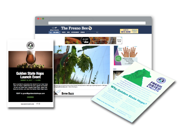
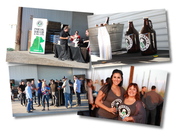
Since Golden State Hops has such a niche target market, we were excited to generate qualified leads for this new business. Our approach was simple: invite the leading breweries in a 60-mile radius of the farm and give those brewers a glimpse inside a real hop farm. More than 80% of the guests invited attended that warm August evening event and enjoyed local beer and one of Fresno’s most popular food trucks.
Public Relations
The resilience and skill of the team behind Golden State Hops was a story that simply had to be told. Our public relations team worked with local media and secured placements on three of the four major broadcast networks and the Central Valley’s largest print publication.
Samsons
Logo Design
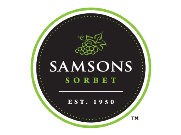
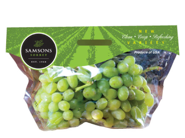
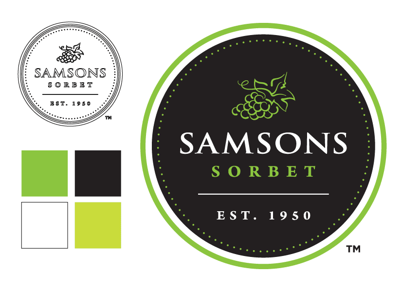
The care and nurturing it takes to produce quality table grapes has truly become an art. Our team was tasked with creating a logo that could communicate that art. Highlighted by a stylized bunch of table grapes, the Samsons Sorbet logo incorporates a clean style and pulls from the rich family heritage of Fowler Packing.
Product Packaging
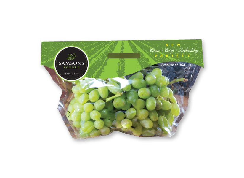
When you’re walking the aisles of your local grocery store, you recognize quality and know the integrity of the company that farms it. When our creative experts designed the product packaging for the Samsons Sorbet table grapes, we designed an eye-catching product packaging that consumers could easily identify for future purchases.
“I TRULY APPRECIATE THE CARE AND ATTENTION TO DETAIL THAT JP MARKETING HAS PROVIDED THROUGHOUT OUR ENTIRE RELATIONSHIP. I LOOK FORWARD TO WORKING TOGETHER ON EVEN BIGGER PROJECTS IN THE FUTURE!”
– JUSTIN PARNAGIAN, CEO
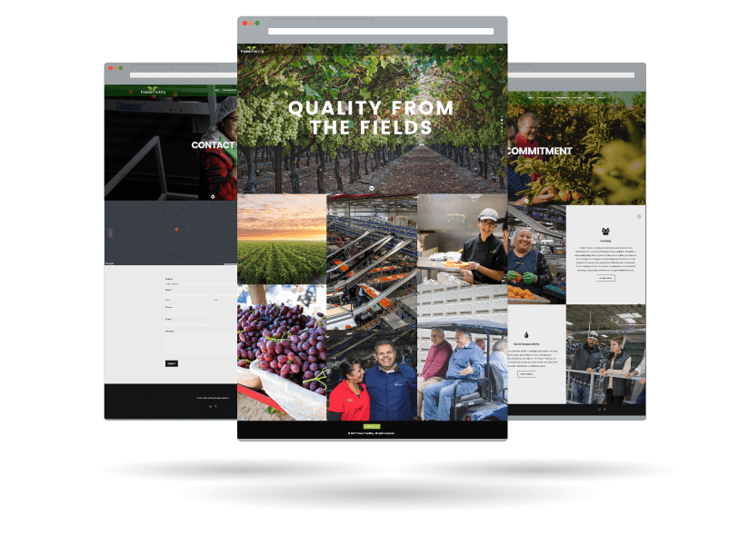
Ag Website
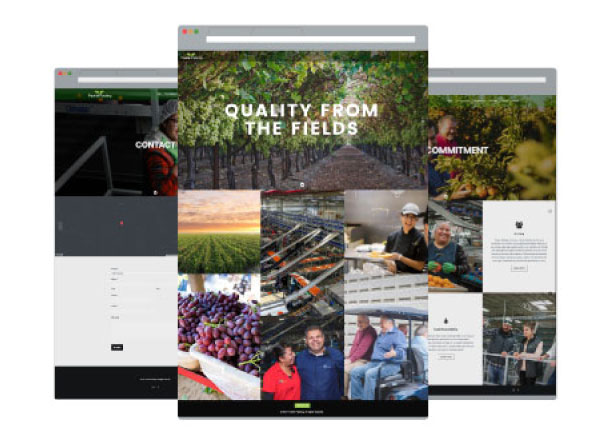
- Video Integration
- CMS Accessible
- Inventory Management
- Mobile Responsive
- Cross Browser Adaptability
Sales Materials
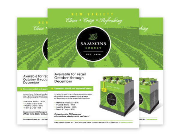
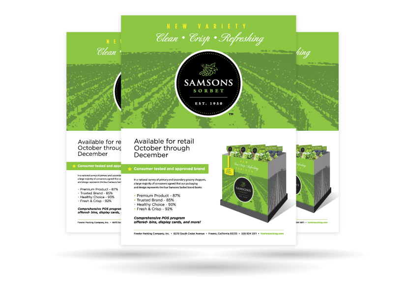
Communicating with your target audience doesn’t have to be difficult. We know that your audience wants a clear message that can capture the value of your program versus the competition. These sales materials can be used across multiple platforms, increasing your return on investment.
Trade Show Booth
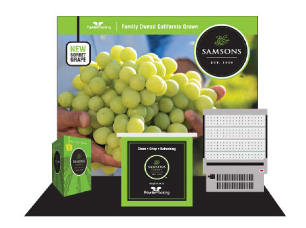
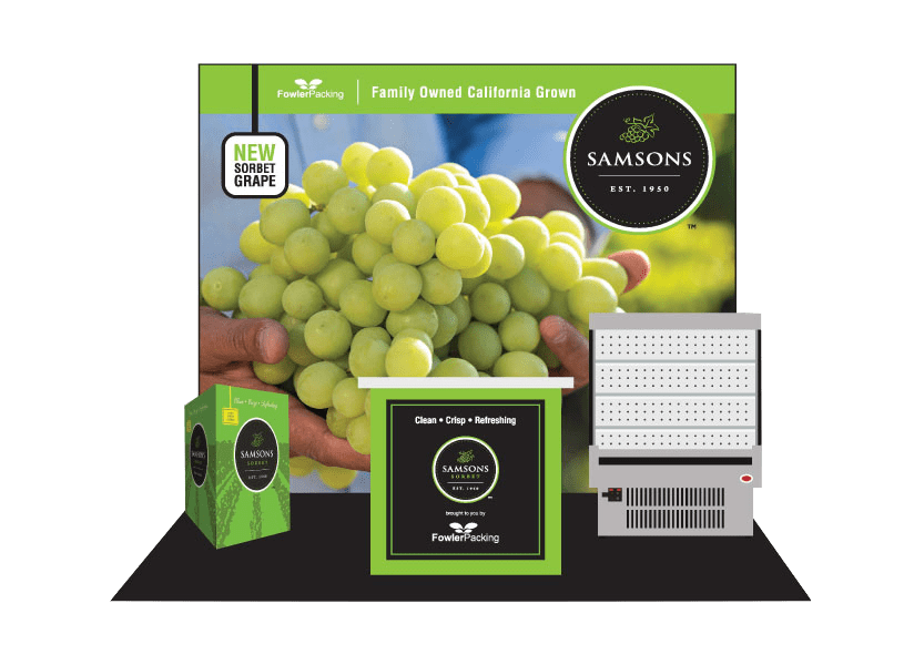
The key to success at any trade show is grabbing the attention of your potential customers. With a booth that is designed to be both productive and visually appealing, your sales team will have a chance to meet with more customers. That first conversation is important and your trade show booth should reflect that.
Ziveli
Branding & Logo
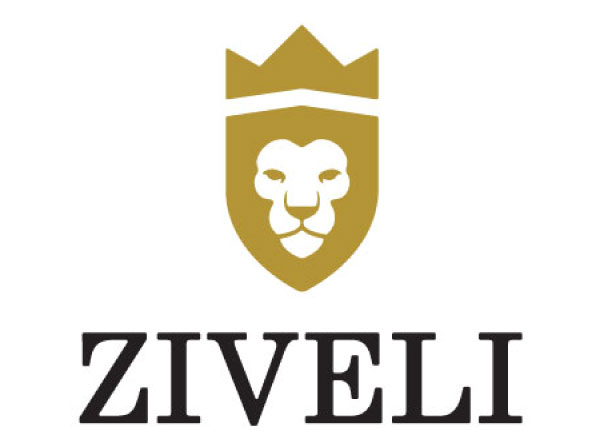
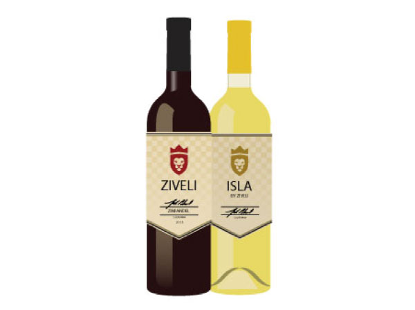
There is more than meets the eye in the logo designed for Ziveli Winery. Inspired by the lion in the Nale family crest, the concept of the logo was designed to encompass the family’s commitment to quality wine and a zest for life. Cheers!
Product Packaging
Raise your glass! We were tasked with creating an eye-catching label that would look seamless and work well with its red and white wines. The name Ziveli (pronounced zhe vah lee’) is the Croatian word for cheers and serves as the mantra for how the Nale family wanted its customers to enjoy Ziveli wine.
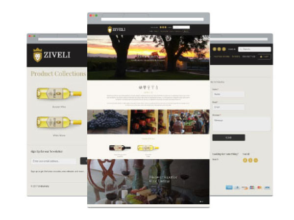
Ecommerce Website
- Shopify Integration
- CMS Accessible
- Inventory Management
- Mobile Responsive
- Cross-Browser Adaptable

