Nutcher Milk
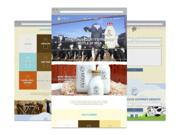
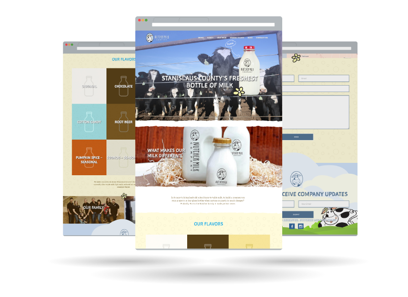
Responsive Website
- Modern, Full-Width Design
- CMS Integration
- SEO Optimized
- Dynamic Menus and Post Types
- Cross Browser Adaptability
- Screen Responsive
- Performance Optimized
Product Packaging
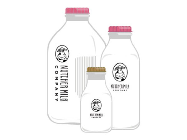
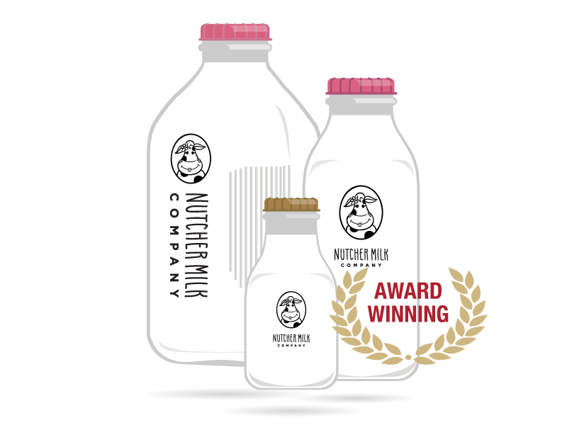
When launching a new product or brand, you want your product packaging to match your brand standards yet be eye-catching to new consumers. We dynamically designed a bottle to tell a story and stand out from the competition.
NUTCHER MILK COMPANY WAS AWARDED THE 2016 GOLD ADDY FOR BOTH THE PACKAGING OF A SINGLE UNIT AND LOGO DESIGN FOR THE WORK WE CREATED.
Branding & Logo
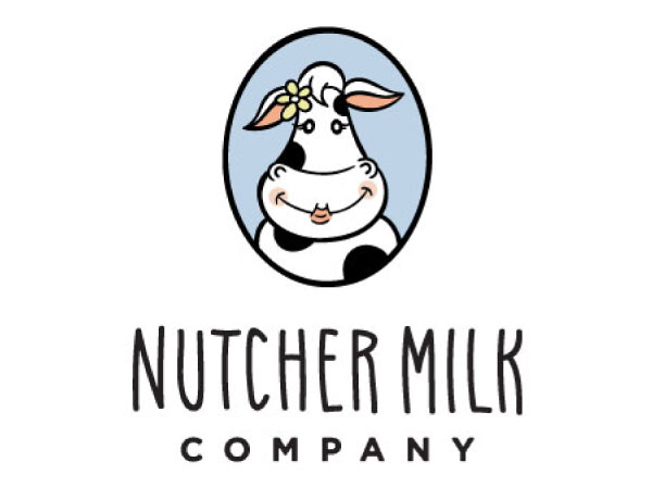
To capture all those honest-to-goodness family values in a brand, we knew the logo needed to feel inviting. Farm to Shelf’s in-house designers and illustrators landed on the perfect illustration of a sweet smiling cow named Heidi accompanied by a playful handwritten font. Heidi shows the love and respect the Nutcher family has for their “girls”. Bonus: the flower on her ear serves as a complementary element in other branding materials. Brilliant!
Sales Materials
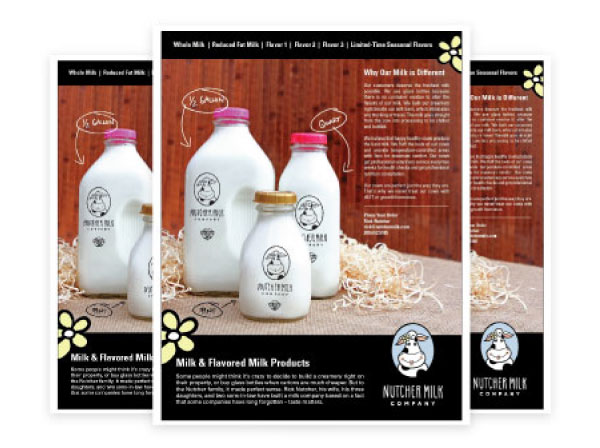
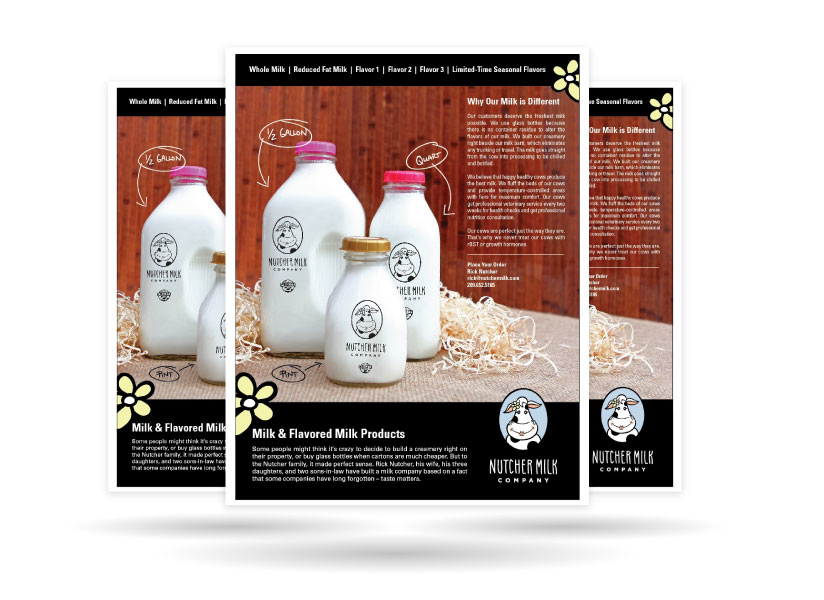
To meet the needs of vendors and customers, a series of one-sheets were produced to communicate the values and flavors of Nutcher Milk Company’s products. The sales materials can be used in cross-promotion efforts including industry trade shows, business development, and customer acquisition.
Onsite Photography
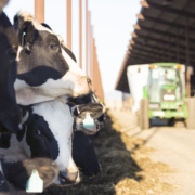
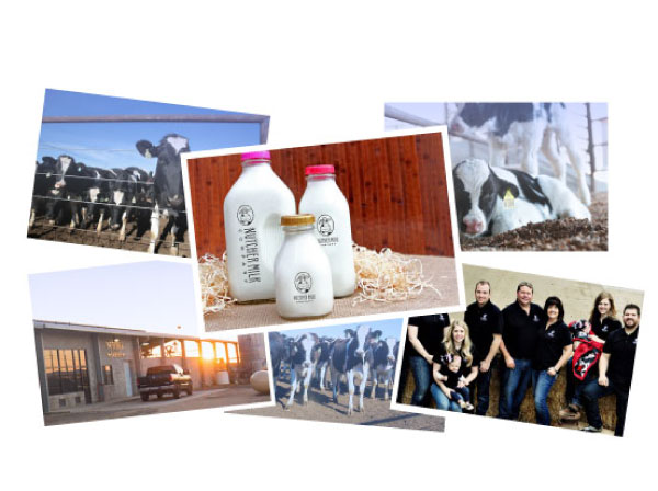
Farm to Shelf’s in-house photographer traveled to Stanislaus County to capture onsite ag photography at the dairy and creamery. The photos from the multi-day shoot include photos of the product, farm, cows and the Nutcher family.
Golden State Hops
Logo Design & Branding
When you look at the up-and-comers in the brewing industry, branding is everything. We created a brand that not only conveyed a strong and serious attitude, but allowed customers to make the visual connection that these were California-grown hops. This full-formed logo allows the hop-holding bear to be a standalone brand mark as Golden State Hops evolves.
Business Cards
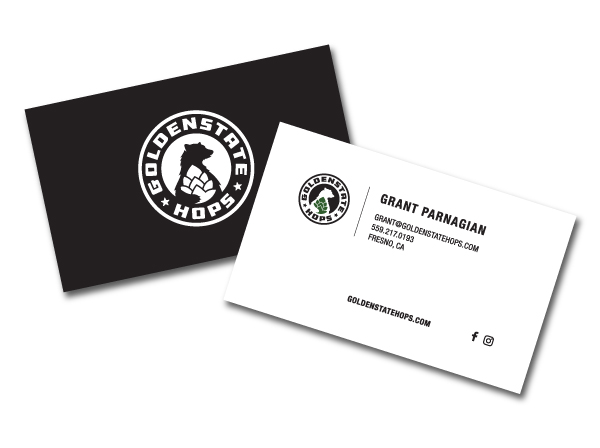
Networking would prove to be one of the best marketing tactics for Golden State Hops, as its team met with brew masters from across Central California. In lieu of traditional advertising, this business card would be the first step in its valuable business partnerships.
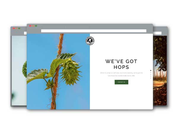
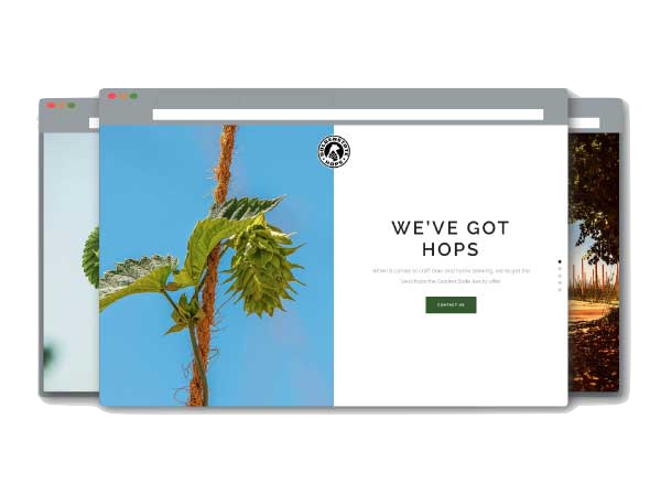
Ag Website
- CMS Accessible
- High Resolution Photography
- Mobile Optimization
- Cross Browser Adaptability
Event Planning
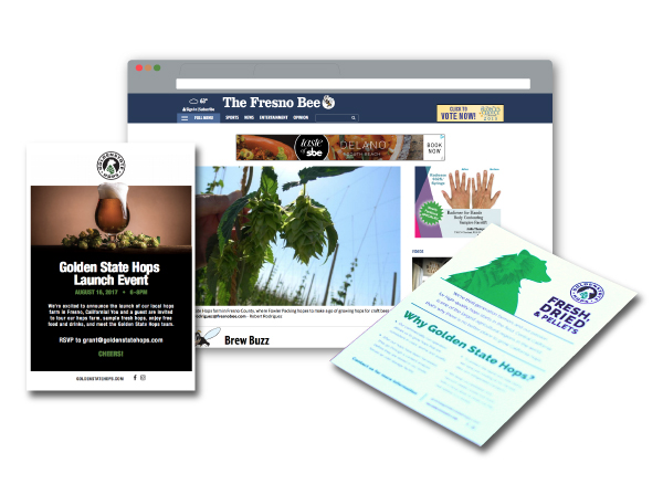
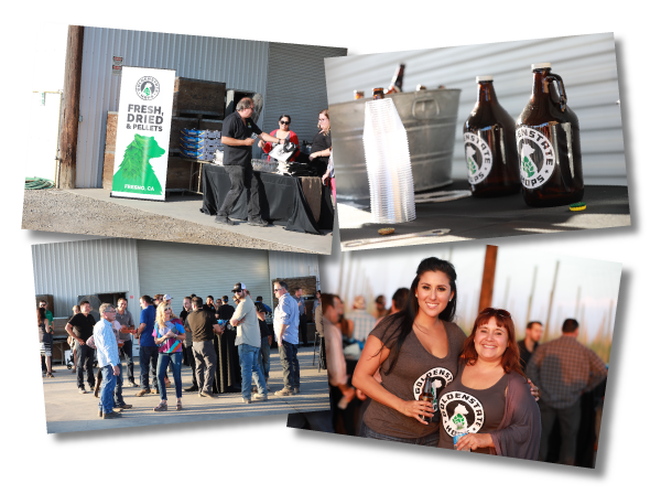
Since Golden State Hops has such a niche target market, we were excited to generate qualified leads for this new business. Our approach was simple: invite the leading breweries in a 60-mile radius of the farm and give those brewers a glimpse inside a real hop farm. More than 80% of the guests invited attended that warm August evening event and enjoyed local beer and one of Fresno’s most popular food trucks.
Public Relations
The resilience and skill of the team behind Golden State Hops was a story that simply had to be told. Our public relations team worked with local media and secured placements on three of the four major broadcast networks and the Central Valley’s largest print publication.
Samsons
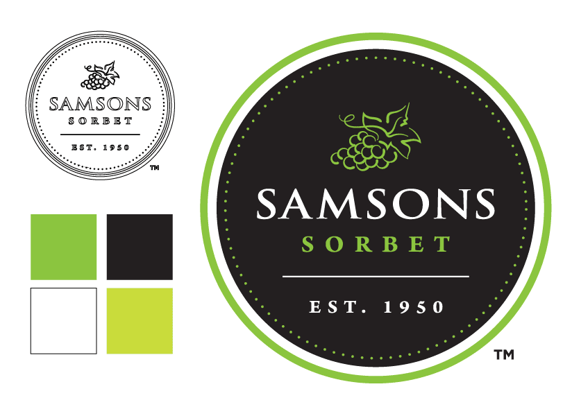
Logo Design
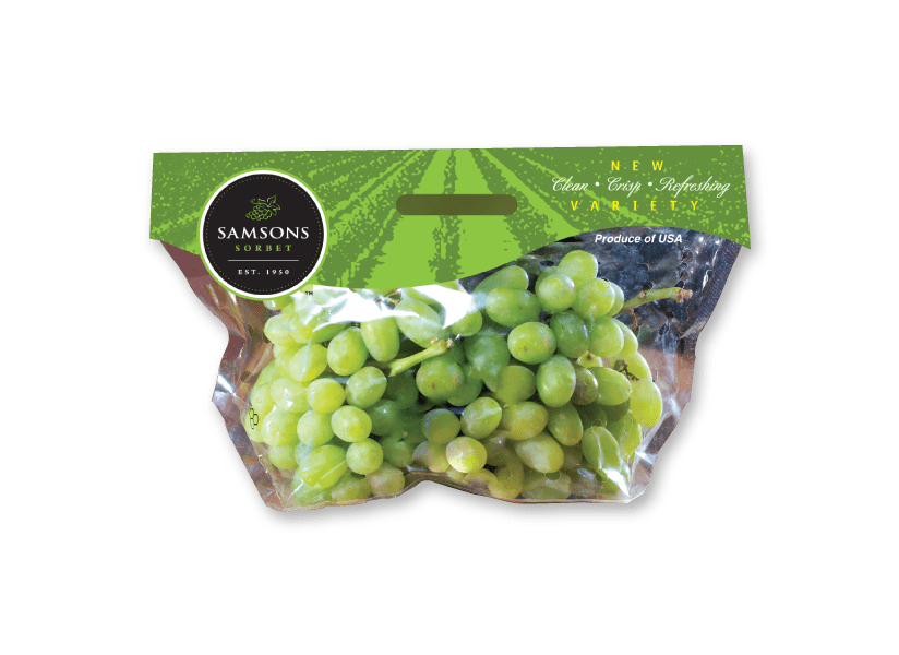
The care and nurturing it takes to produce quality table grapes has truly become an art. Our team was tasked with creating a logo that could communicate that art. Highlighted by a stylized bunch of table grapes, the Samsons Sorbet logo incorporates a clean style and pulls from the rich family heritage of Fowler Packing.
Product Packaging
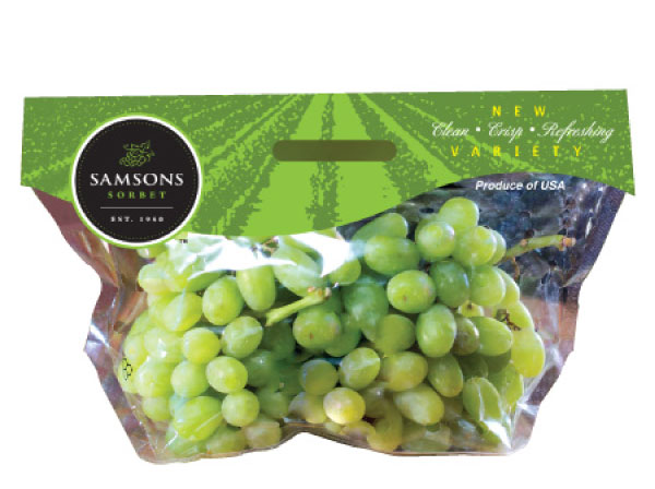
When you’re walking the aisles of your local grocery store, you recognize quality and know the integrity of the company that farms it. When our creative experts designed the product packaging for the Samsons Sorbet table grapes, we designed an eye-catching product packaging that consumers could easily identify for future purchases.
“I TRULY APPRECIATE THE CARE AND ATTENTION TO DETAIL THAT JP MARKETING HAS PROVIDED THROUGHOUT OUR ENTIRE RELATIONSHIP. I LOOK FORWARD TO WORKING TOGETHER ON EVEN BIGGER PROJECTS IN THE FUTURE!”
– JUSTIN PARNAGIAN, CEO
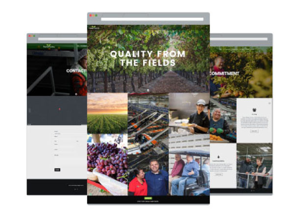
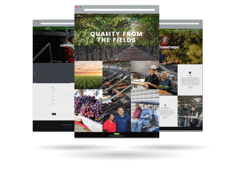
Ag Website
- Video Integration
- CMS Accessible
- Inventory Management
- Mobile Responsive
- Cross Browser Adaptability
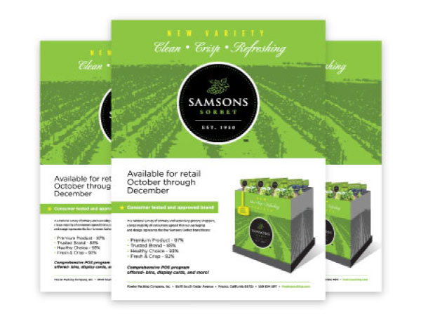
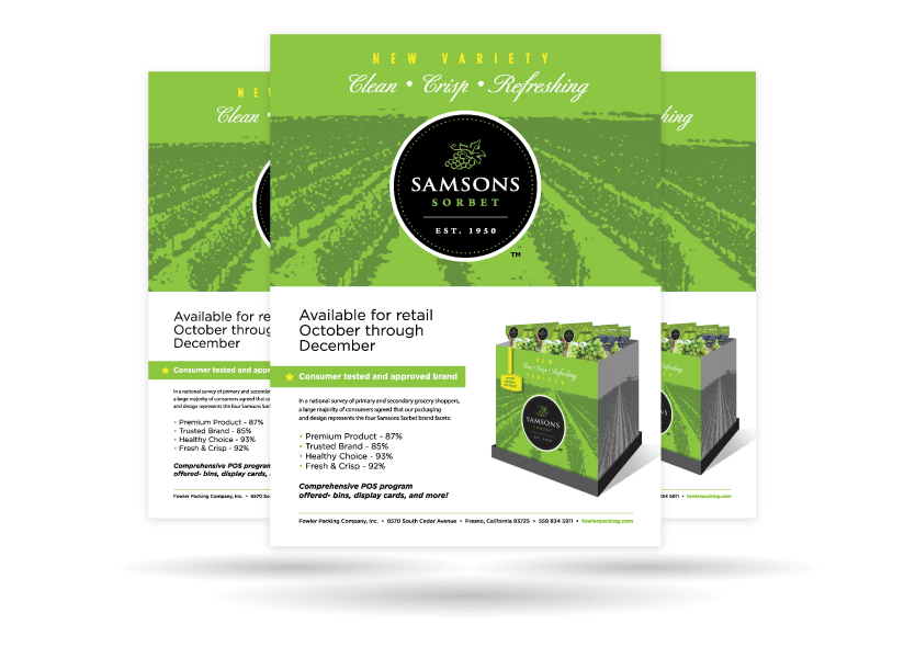
Sales Materials
Communicating with your target audience doesn’t have to be difficult. We know that your audience wants a clear message that can capture the value of your program versus the competition. These sales materials can be used across multiple platforms, increasing your return on investment.
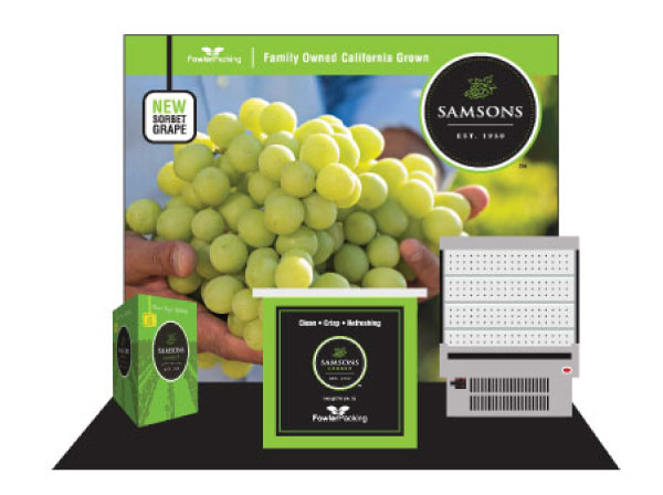
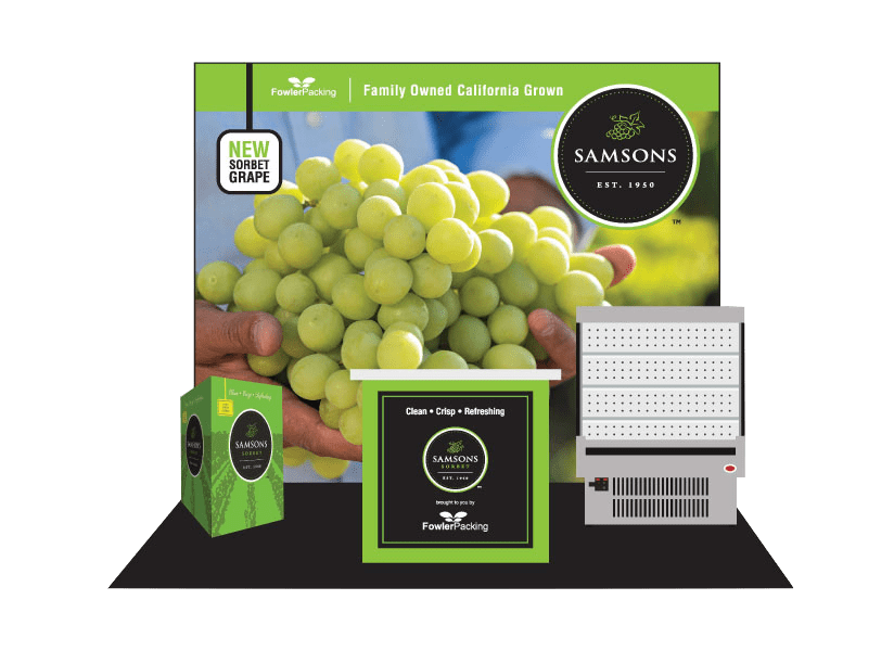
Trade Show Booth
The key to success at any trade show is grabbing the attention of your potential customers. With a booth that is designed to be both productive and visually appealing, your sales team will have a chance to meet with more customers. That first conversation is important and your trade show booth should reflect that.
Ziveli
Branding & Logo
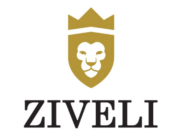
There is more than meets the eye in the logo designed for Ziveli Winery. Inspired by the lion in the Nale family crest, the concept of the logo was designed to encompass the family’s commitment to quality wine and a zest for life. Cheers!
Product Packaging
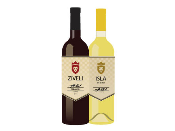
Raise your glass! We were tasked with creating an eye-catching label that would look seamless and work well with its red and white wines. The name Ziveli (pronounced zhe vah lee’) is the Croatian word for cheers and serves as the mantra for how the Nale family wanted its customers to enjoy Ziveli wine.
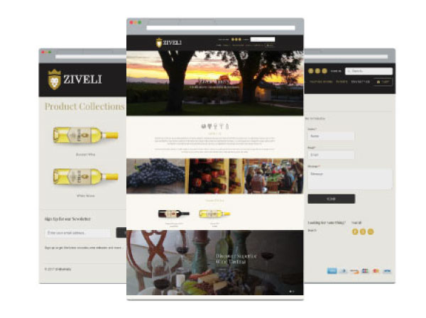
Ecommerce Website
- Shopify Integration
- CMS Accessible
- Inventory Management
- Mobile Responsive
- Cross-Browser Adaptable
Simmis
Branding
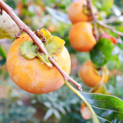
When you think persimmons, you probably think cookies or bread. However, the Fuyu variety is not for baking… it’s for biting!
Unlike traditional persimmons, the Fuyu variety is crisp and sweet, sort of like biting into an apple but tasting like autumn. To begin this consumer education challenge, we needed a product name. Together with the client, we settled on Simmis. It’s simple, catchy and a palindrome (same spelling backward and forward): a designer’s dream. Most of all, the play on the name persimmon immediately references the product itself while being approachable and memorable.
Like apples, you can bite into them or slice them. We used the directional tagline, “Take a Bite. Share a Slice”, as another way to educate buyers.
Packaging
Inspired by the product’s skin color, we used purple and orange throughout, which are complementary hues on a color wheel.
When we designed the Simmis bags, we wanted to signal to shoppers that just like apples, you can slice or bite right into Simmis. The clear window also allows buyers to see Simmis’ attractive color, which enhances the overall look of the packaging.
When designing the bags, boxes and bins, we wanted to incorporate educational tidbits in an artistic way. When sliced vertically, Fuyu persimmons resemble the look of a sand dollar, so we utilized a freehand illustration of this shape throughout the design.
Photography
Our in-house photographer had the opportunity to take multiple product photoshoots in our studio when the Simmis were at the peak of their freshness. In addition to the standard glamour shots of Simmis, we shot bags, boxes and bins as well as lifestyle images that included a human element. To enhance featured recipes on the online landing page and social media, we also sliced and staged them on a charcuterie board and paired them with PureFresh pomegranates on a salad for a perfect cross-selling opportunity.
Landing Page
PureFresh’s main site hadn’t yet been refreshed, but we couldn’t wait. We had to quickly put together a fun landing page that could live within a website that wasn’t yet updated. Our web developers put together a single page that reflected the Simmis look and feel featuring recipes and key nutritional information.
Social Media Management
The key to a successful strategy is scroll-stopping content. Our design team created fun, branded graphics to help build a digital presence. With some crisp, sweet content in hand, our media team created an engaging and informative strategy for @eatsimmis on Facebook and Instagram. We organically built a community of followers by combining colorful, eye-catching insights with interactive posts.
Retail Program
With a new name and a new look, Simmis was ready for its retail store debut! To entice produce buyers, we put together a paid digital program that would entice consumers into stores to buy and try. Stater Bros. in Southern California bit on this co-branded opportunity, and its stores enjoyed the benefit of paid advertising in the one-mile radius of each store. The messaging, “Take a Bite. It’s just a Buck.” reinforced the special pricing offer, and consumers responded. The combined in-store displays and digital advertising resulted in an increase of over 50% in Simmis shipments to Stater Bros. in 2020 versus 2019. The Simmis branding and campaign efforts were so successful that PureFresh is applying a similar strategy to other commodities in 2021.

