Nic’s Mix
Research
Nichols Farms came to us wanting to create packaging that reflected its family legacy as it launched a mixed nut product into Costco. Ensuring that a product will sell off this mega-retailers shelves is the secret to long term product placement. As we worked through packaging designs, we incorporated target audience research to assist in the final design selection. This real shopper data allowed us insights into the packaging appeal of other pistachio and mixed nut retailers as well as provided clear direction for design revisions that would resonate with consumers.
Packaging
Since Nichols Farms has been in the farming industry since 1983, incorporating the history of Nichols Farms into the product was important. So, when we finalized the naming and created the packaging for Nic’s Mix, we included subtle nods to its origins while keeping things light and playful.
The front of the packaging includes nature patterns to represent the orchards planted more than 35 years ago. The whimsical logo matched with the bold product photo showcases the feel of what Nic’s Mix is. A clear window into the product itself boldly and visually draws a consumer’s eye. Finally, the back of the packaging highlights the story of Nichols Farms, an integral part of the character of the product.
Trade Show Banners
I guess you can say we are nuts about trade shows, so we were excited to create retractable banners showcasing the yummy products in Nic’s Mix. We started with the key to Nichols Farms: pistachios, the main ingredient in Nic’s Mix and the nut that started it all. This gave the banners an eye-catching look while sticking true to the brand and the cascade of products.
Photography
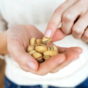
We started shooting for Nic’s Mix as soon as we could get our hands on the product. We knew that including a bold photo of the product was going to be the best way to showcase exactly what the product was. Once the packaging was finalized was when the real fun began. Some may say shooting a product that has a picture you took on it is pretty meta, but we just call that a normal Tuesday.
Crystal Valley Foods
Branding
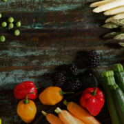
Creating a fun and fresh update to an already great brand is one of our specialities. For Crystal Valley Foods, we focused on what it stands for: quality. As industry leaders in sustainable growing practices, we focused on curating a brand that showcased the highest-quality fruits and vegetables for which Crystal Valley Foods was best known.
Packaging
When creating a design for the packaging, we knew that we needed to elevate the layout to showcase the quality of the products, while maintaining the look customers knew and loved. So, we created simple yet sleek designs that brought in elements of Crystal Valley Foods’ history. Our favorite? The bold zig-zags that represent the iconic mountains of Crystal Valley Foods.
Logo Refresh
The key to a true logo refresh is seeing what works and what doesn’t. For Crystal Valley Foods, it was all about balance and symmetry. In perfecting the balance and symmetry of the logo, the crisp, updated logomark created harmony for the brand. This refresh was a testament to the quality of the brand’s promise of delivering the highest-quality goods every time.
Simmis
Branding
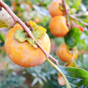
When you think persimmons, you probably think cookies or bread. However, the Fuyu variety is not for baking… it’s for biting!
Unlike traditional persimmons, the Fuyu variety is crisp and sweet, sort of like biting into an apple but tasting like autumn. To begin this consumer education challenge, we needed a product name. Together with the client, we settled on Simmis. It’s simple, catchy and a palindrome (same spelling backward and forward): a designer’s dream. Most of all, the play on the name persimmon immediately references the product itself while being approachable and memorable.
Like apples, you can bite into them or slice them. We used the directional tagline, “Take a Bite. Share a Slice”, as another way to educate buyers.
Packaging
Inspired by the product’s skin color, we used purple and orange throughout, which are complementary hues on a color wheel.
When we designed the Simmis bags, we wanted to signal to shoppers that just like apples, you can slice or bite right into Simmis. The clear window also allows buyers to see Simmis’ attractive color, which enhances the overall look of the packaging.
When designing the bags, boxes and bins, we wanted to incorporate educational tidbits in an artistic way. When sliced vertically, Fuyu persimmons resemble the look of a sand dollar, so we utilized a freehand illustration of this shape throughout the design.
Photography
Our in-house photographer had the opportunity to take multiple product photoshoots in our studio when the Simmis were at the peak of their freshness. In addition to the standard glamour shots of Simmis, we shot bags, boxes and bins as well as lifestyle images that included a human element. To enhance featured recipes on the online landing page and social media, we also sliced and staged them on a charcuterie board and paired them with PureFresh pomegranates on a salad for a perfect cross-selling opportunity.
Landing Page
PureFresh’s main site hadn’t yet been refreshed, but we couldn’t wait. We had to quickly put together a fun landing page that could live within a website that wasn’t yet updated. Our web developers put together a single page that reflected the Simmis look and feel featuring recipes and key nutritional information.
Social Media Management
The key to a successful strategy is scroll-stopping content. Our design team created fun, branded graphics to help build a digital presence. With some crisp, sweet content in hand, our media team created an engaging and informative strategy for @eatsimmis on Facebook and Instagram. We organically built a community of followers by combining colorful, eye-catching insights with interactive posts.
Retail Program
With a new name and a new look, Simmis was ready for its retail store debut! To entice produce buyers, we put together a paid digital program that would entice consumers into stores to buy and try. Stater Bros. in Southern California bit on this co-branded opportunity, and its stores enjoyed the benefit of paid advertising in the one-mile radius of each store. The messaging, “Take a Bite. It’s just a Buck.” reinforced the special pricing offer, and consumers responded. The combined in-store displays and digital advertising resulted in an increase of over 50% in Simmis shipments to Stater Bros. in 2020 versus 2019. The Simmis branding and campaign efforts were so successful that PureFresh is applying a similar strategy to other commodities in 2021.


