SimpliPure
Brand Development
DairyAmerica came to us with a simple goal: brand a new, premium lactose product produced by a cooperative of shareholding dairy farmers across the country. We started with the basics: brand positioning, brand architecture, and brand extension. Each served as a logical and strategic step into reaching the target audiences.
From here, the fun began. Once we defined the brand architecture – and how this premium product would align with other DairyAmerica lactose product, we got to work on a name. After some (okay, a lot of) deliberation, we landed on Simplipure: a nod to the simplicity of the product paired with the highest purity standards for lactose.
Logo
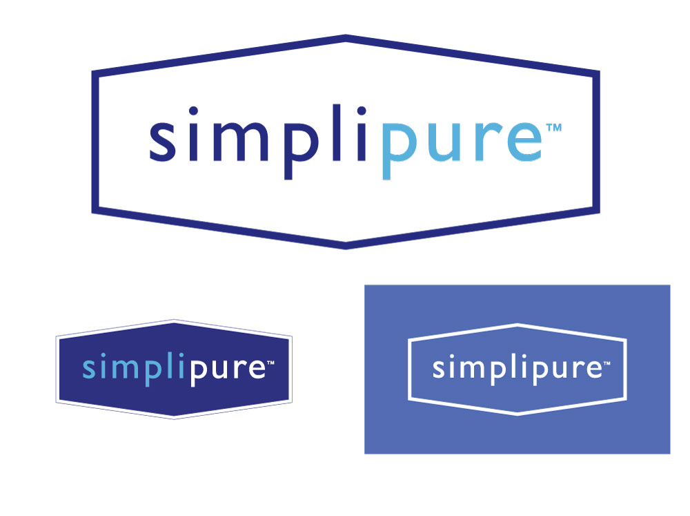
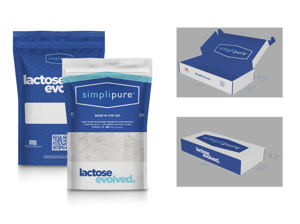
When creating Simplipure’s logo, we knew we wanted to keep it simple yet upscale, just like the product. We took inspiration from lactose itself, with a nod to the food scientists who would be the target audience for purchasing this new product. The hexagons, which frame the brand name, are representative of the shape in which sugar molecules bind together to form lactose. We then brought the logo to life with movement using animation.
Landing Page
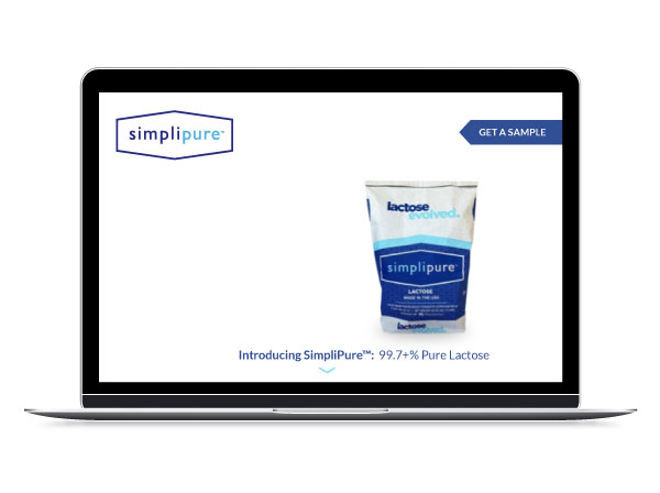
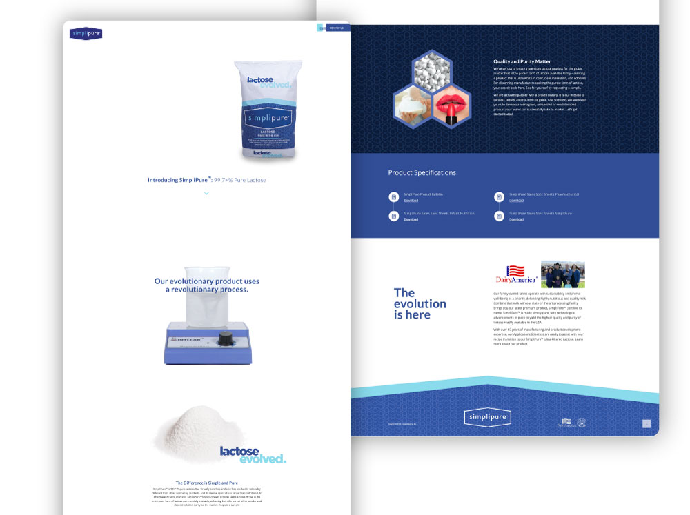
If you don’t have a website, you don’t exist, right? So for Simplipure, we built a landing page that would provide essential information and capture leads in the early stages of the product sales process. The most important message to convey is product clarity, so a time lapse video was built into the page to clearly deliver this mission critical message.
Business Cards
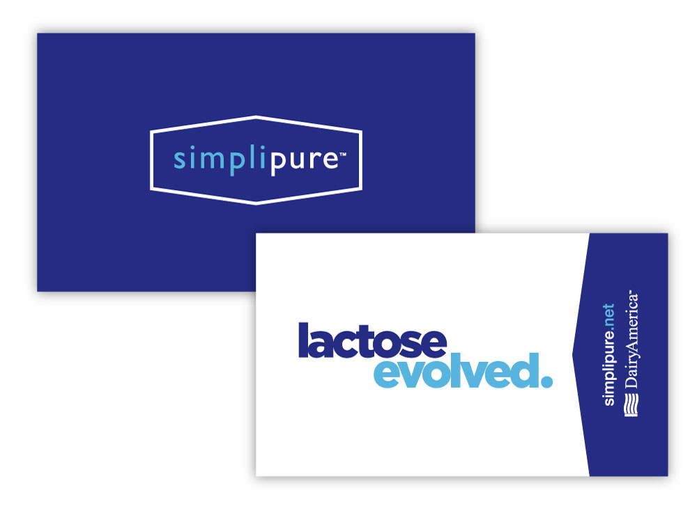
Business cards are an old-school classic that can be a customer’s first impression with a company and its products. We wanted to create a design that grabbed attention while still maintaining the integrity of what Simplipure is. We kept it simple: the logo, the branding and the message. The result? A sleek, innovative twist on an old school classic.
Packaging
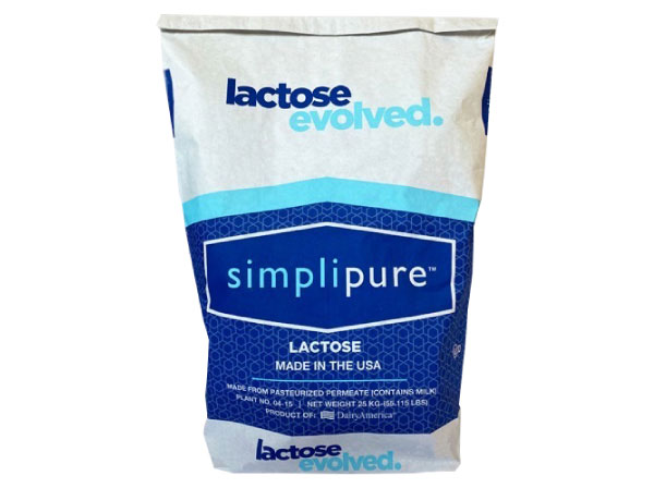
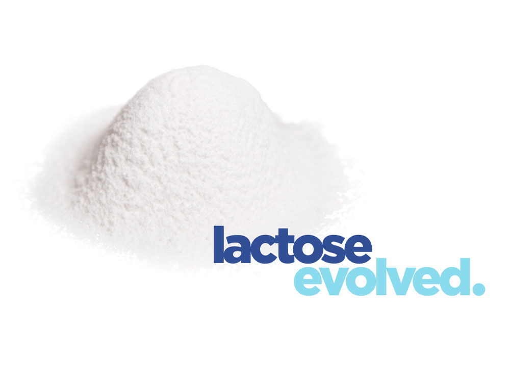
For Simplipure packaging, we wanted to focus on what the product was: lactose evolved. We knew the product could speak for itself, but the packaging needed to signal that this product was different. All of DairyAmerica’s lactose products are packaged in craft paper (brown) color, so we had to do a little convincing to package this product in white. While the white does cost a little more, it immediately conveys that this is a premium product.
Nutcher Milk
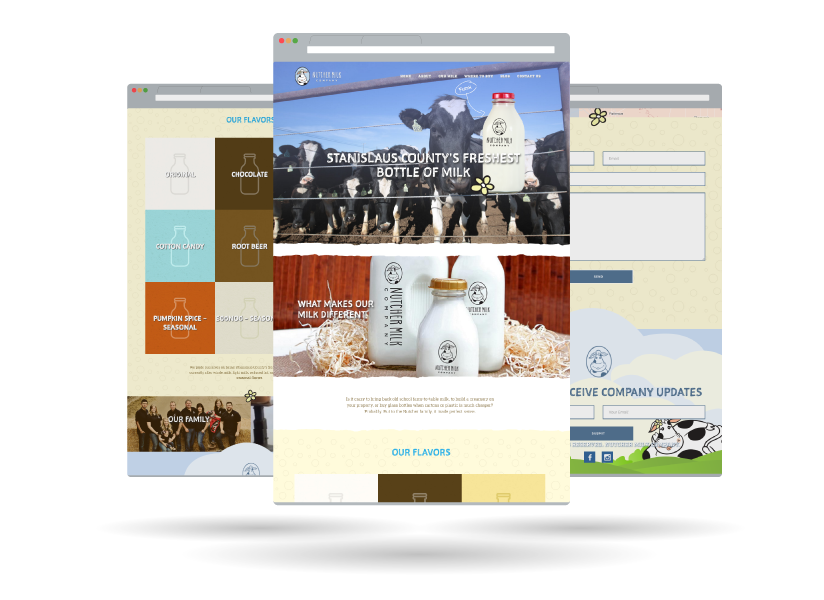
Responsive Website
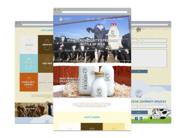
- Modern, Full-Width Design
- CMS Integration
- SEO Optimized
- Dynamic Menus and Post Types
- Cross Browser Adaptability
- Screen Responsive
- Performance Optimized
Product Packaging
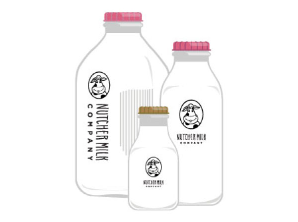
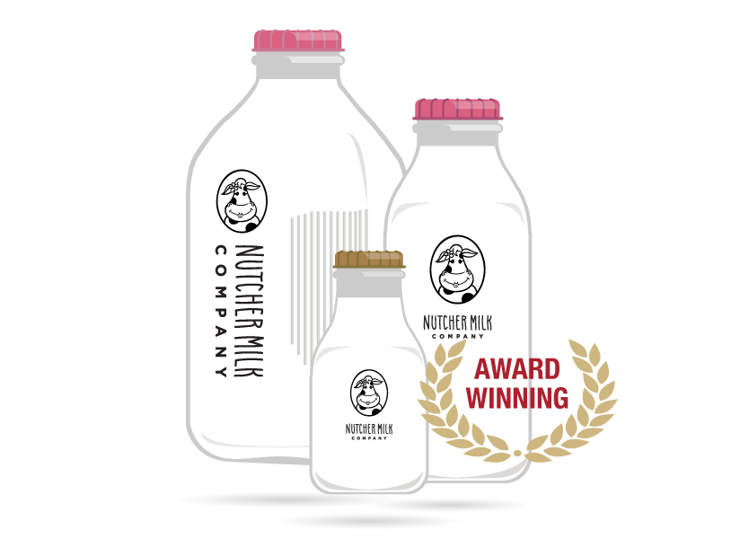
When launching a new product or brand, you want your product packaging to match your brand standards yet be eye-catching to new consumers. We dynamically designed a bottle to tell a story and stand out from the competition.
NUTCHER MILK COMPANY WAS AWARDED THE 2016 GOLD ADDY FOR BOTH THE PACKAGING OF A SINGLE UNIT AND LOGO DESIGN FOR THE WORK WE CREATED.
Branding & Logo
To capture all those honest-to-goodness family values in a brand, we knew the logo needed to feel inviting. Farm to Shelf’s in-house designers and illustrators landed on the perfect illustration of a sweet smiling cow named Heidi accompanied by a playful handwritten font. Heidi shows the love and respect the Nutcher family has for their “girls”. Bonus: the flower on her ear serves as a complementary element in other branding materials. Brilliant!
Sales Materials
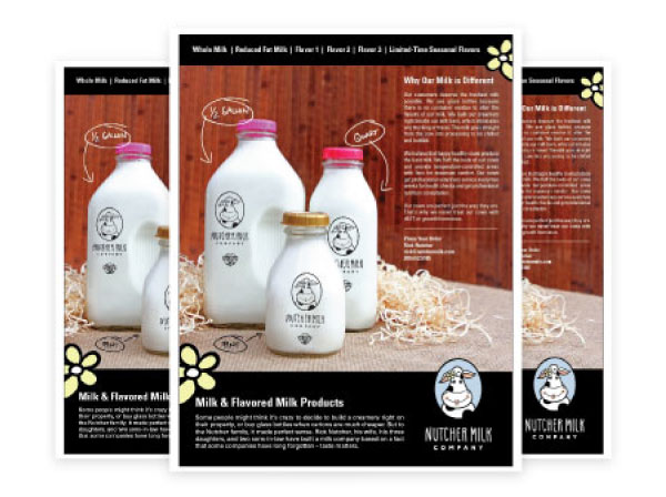
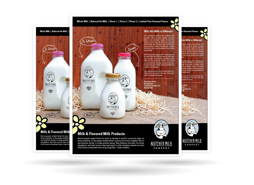
To meet the needs of vendors and customers, a series of one-sheets were produced to communicate the values and flavors of Nutcher Milk Company’s products. The sales materials can be used in cross-promotion efforts including industry trade shows, business development, and customer acquisition.
Onsite Photography
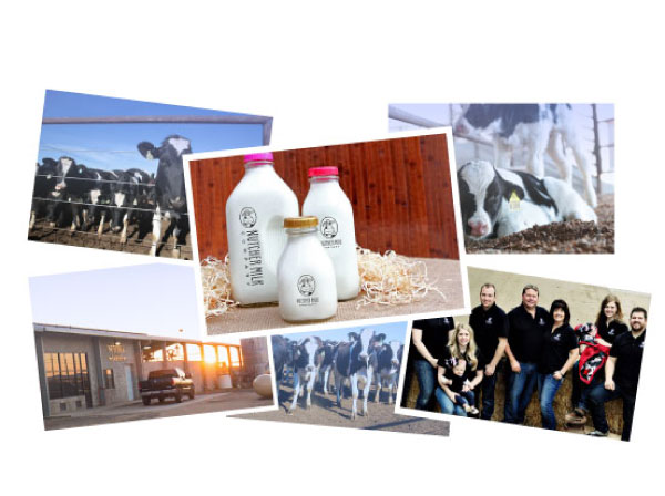
Farm to Shelf’s in-house photographer traveled to Stanislaus County to capture onsite ag photography at the dairy and creamery. The photos from the multi-day shoot include photos of the product, farm, cows and the Nutcher family.


